Amazon A+ Content with Examples
- Nic Delorme
- Apr 5, 2022
- 4 min read
Amazon A+ content is a perfect way for brands to enhance the shopping experience for customers. Using Amazon A+ content elevates the brand’s page into more of a storefront than a normal seller’s storefront on Amazon.

This is what a normal storefront looks like without Amazon A+ content. As you can see, it just looks like a normal search result page in Amazon. There is no branding of any kind and the only option the customer has is to click on a product and navigate to each product page. This is a lot less exciting than what is found on a brand’s storefront that includes Amazon A+ content.
As you can see, KitchenAid’s storefront uses Amazon A+ content to help customers browse their products in an interesting and easy way. The navigation bar allows customers to easily find the kinds of products they are interested in. The feature lifestyle shots of their products in use which is a fun way to use product photography.
While Amazon A+ content can be really useful for sellers, there are some limitations on who can use it.
Who can use Amazon A+ content?
According to Amazon, “Professional sellers who have been approved as brand owners through the Amazon Brand Registry process, as well as emerging brand owners who are part of certain managed selling programs, such as Launchpad and Amazon Exclusives” are able to use Amazon A+ content.
Sellers who are vendors will automatically be able to use it as well.
Best Practices for Amazon A+ Content
There are some best practices to keep in mind before designing your Amazon A+ content:
Remember to proofread copy for grammatical and spelling errors.
Prioritize images and use text wisely.
Use a banner to catch customers’ attention quickly.
Double check each module’s image size and resolution requirements.
Now, on to the examples!
Examples of Amazon A+ Content
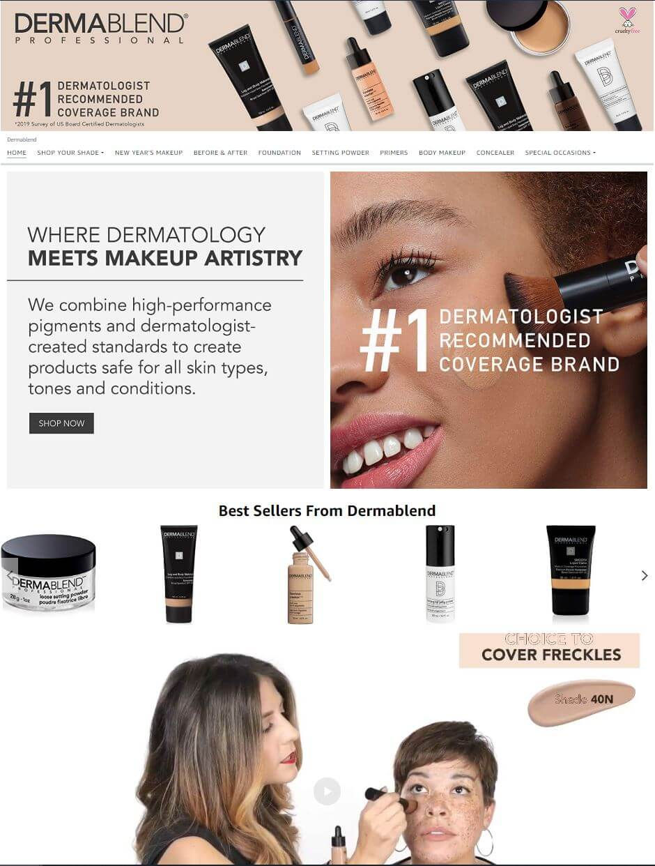
First, we have DermaBlend. This brand makes professional makeup and is often used to cover up tattoos for various reasons. On their storefront on Amazon, they have used Amazon A+ content in a number of ways to highlight their products. They have a carousel which makes it easy for customers to quickly cycle through various products. Underneath that, they have a video that showing the makeup being applied to a woman with a lot of freckles. Using video is great way to show products in use and give customers a better idea of how to use the product.
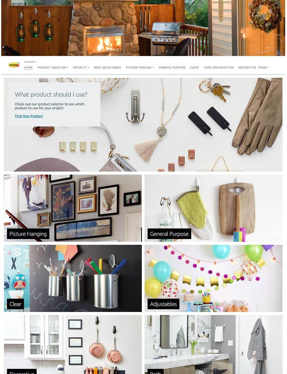
Next is the brand Command. One of the things Command does well with their use of Amazon A+ content is highlight all of the different ways their products can be used. Command’s various products for hanging things might seem boring, but if you look at the many different ways they’ve shown the products in use, it’s actually quite captivating. They’ve utilized lots of different colors, textures, and uses. This is a perfect example of how you can get creative with product photography to help your products attract customers!
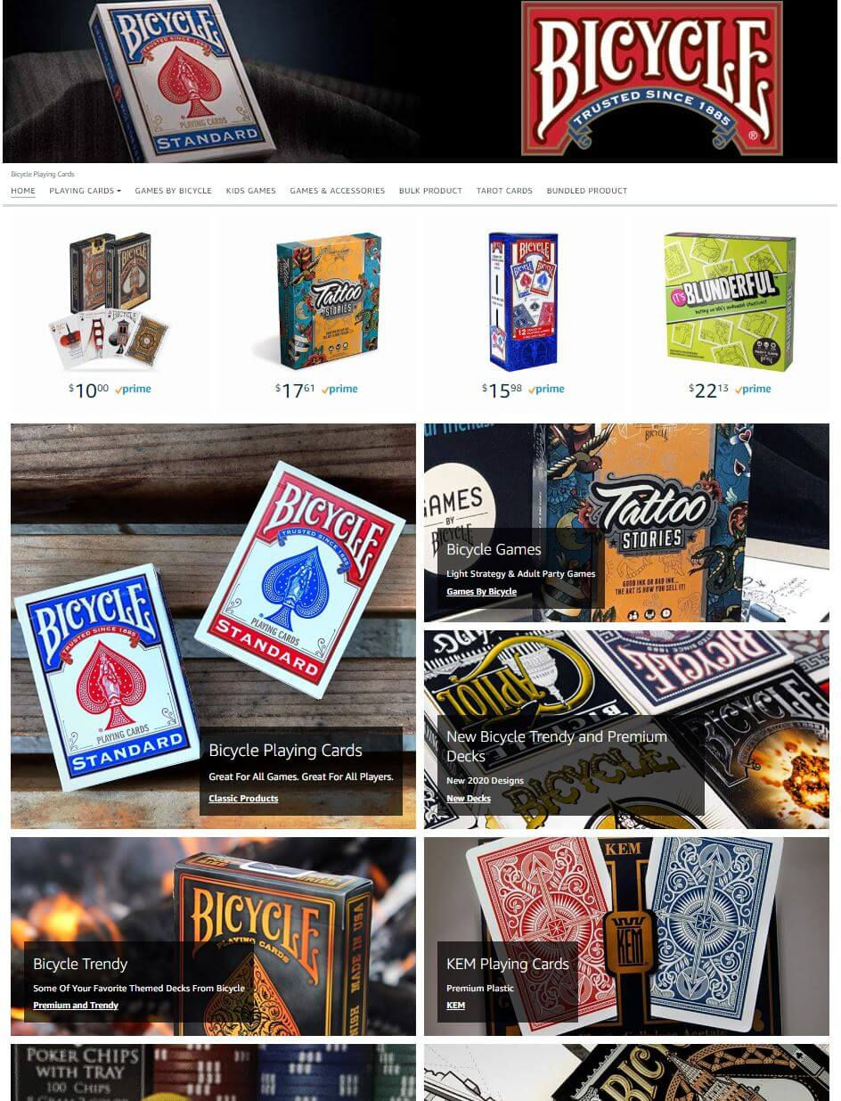
Bicycle has chosen a blocky vibe for their Amazon A+ content. True to their branding, they’ve stuck to the red and blue, along with their signature font highlighted throughout the page. While the brand is known for playing cards, they’ve showcased some of their other games above the image blocks, which is smart. This will help direct customers to products you want them to check out, even though they might be a little different than what you traditionally offer.
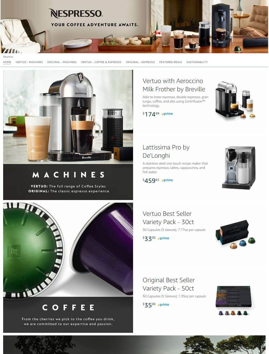
Nespresso has chosen a much different, yet intriguing approach with their Amazon A+ content. (Nespresso coffee is the office favorite here at Sellozo!) They have used a two column layout, with products featured on one side, and large block images with text overlays on the other. This layout is sleek, simple, and totally on-brand for Nespresso. It’s important to stay consistent with your branding throughout all channels to keep your customers from being confused.
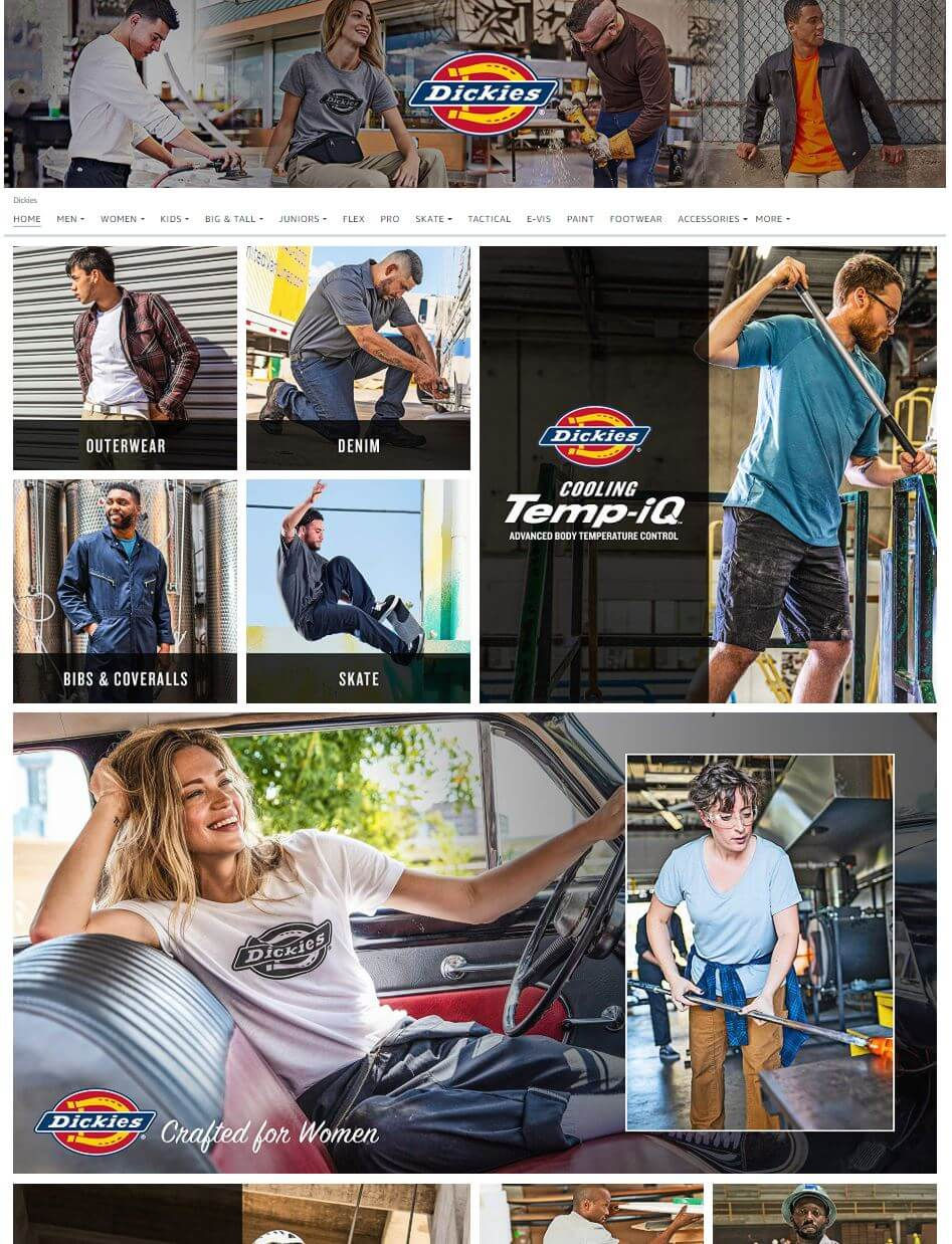
Lastly, Dickie’s has used an image-heavy layout that features their products in lifestyle shots. Lifestyle photography is really important for brands, especially brands that sell clothing or other wearable goods. Showing how the products look on an actual human body (not just a mannequin) is a good way for customers to get an idea of how it might look on their own body. Plus, you can show them fun, creative ways to style the product (like rolling the bottoms of jeans into cuffs for warmer days), which color variations might look good on different skin tones, etc. In Dickie’s case, they’ve done a wonderful job of showcasing that they also have women’s products, not just men’s.
These are just a few examples of Amazon A+ content that I thought were worth looking at. Each is unique and works well for the brand in its own way. It’s important for brands to stay consistent, be creative within their branding, and test A LOT. Don’t be discouraged if your first time using Amazon A+ content gets mixed results. Take the data you’re given in Seller Central and use it to influence your future layouts and designs. And remember to use customer feedback!
Meet the Author: [wbcr_php_snippet id=”18211″]
[wbcr_php_snippet id=”18212″]
[wbcr_php_snippet id=”18210″]
